


Selecting the right font for your outdoor house numbers is essential for both functionality and curb appeal. House numbers serve a critical purpose: they must be easily visible and legible from a distance, helping visitors, delivery personnel, and emergency responders find your home quickly. However, with countless font options available, choosing the most legible fonts for outdoor use can be challenging. The characteristics of legible fonts, highlights popular font choices for outdoor house numbers, and offers tips for selecting the best font to suit your home’s style and practical needs.
Why Font Legibility Matters for Outdoor House Numbers
Font legibility is crucial when selecting house numbers because outdoor visibility can be affected by many factors. Numbers need to be easily readable from the street or driveway, often from several dozen feet away. Varying lighting conditions, both natural and artificial, can impact how clearly numbers are seen throughout the day. Additionally, weather elements like rain, fog, snow, and dirt may obscure or dull the appearance of house numbers over time. Since people typically glimpse house numbers quickly while driving or walking by, choosing clear, distinct fonts improves recognition speed, ensuring your house numbers serve their essential purpose without compromising style.

Characteristics of Highly Legible Fonts for Outdoor Numbers
When choosing fonts for outdoor house numbers, several key characteristics ensure maximum legibility. First, simplicity and clean lines are essential; fonts with minimal decoration, such as sans-serif styles, provide superior clarity by avoiding visual clutter. Second, distinctive shapes for each digit prevent confusion between similar numbers like 1 and 7 or 0 and 8, enabling quick and accurate reading. Adequate weight and thickness are also important fonts that are too thin may become illegible, especially in low light or from a distance. Proper spacing between digits avoids crowding and merging, which enhances overall readability. Finally, balanced proportions of width and height ensure that numbers are neither stretched nor squashed, maintaining clear and consistent visibility from various angles.
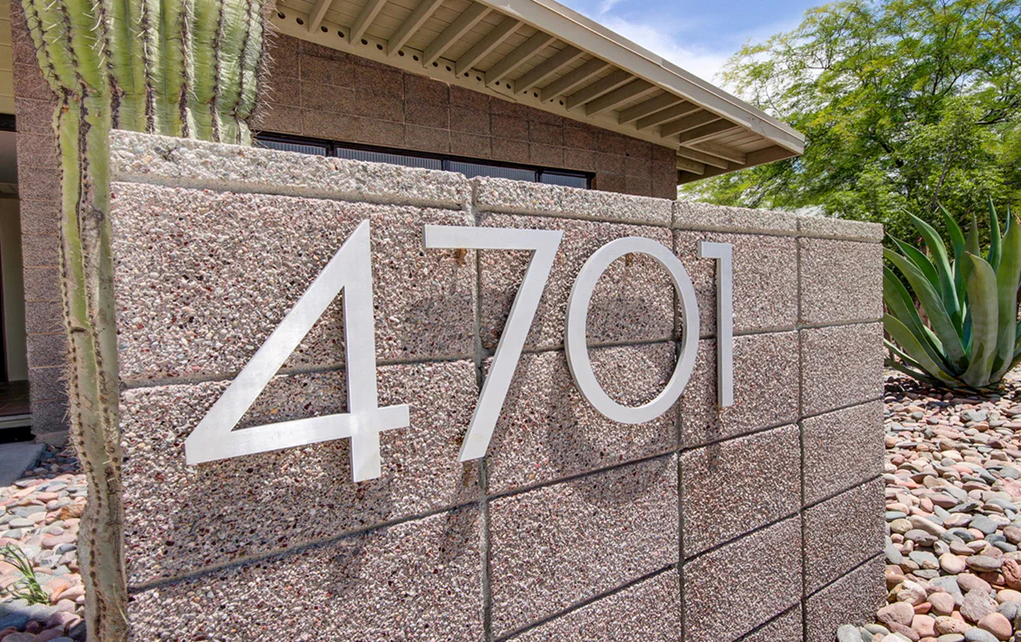
Most Legible Fonts for Outdoor House Numbers
Some of the most popular and legible fonts recommended for outdoor house numbers combine clarity with style. Helvetica, a classic sans-serif font, is known for its clean, neutral design and excellent readability, making it perfect for modern homes with minimalist aesthetics. Futura offers a geometric and modern look, featuring sharp lines and thick strokes that improve legibility from a distance. Arial, another simple and clear sans-serif font, maintains readability across various sizes and lighting conditions, making it a practical choice for outdoor use.
Gotham is bold and professional, ideal for larger house numbers where visibility and impact are essential. The DIN font family, originally designed for industrial use, offers a precise and technical appearance that translates well to house numbers. Verdana, designed for screen readability, performs well outdoors due to its wide spacing and simple forms, enhancing visibility, especially for smaller numbers.
Fonts to Use With Caution
While many fonts look attractive, some may sacrifice legibility outdoors:
- Script Fonts: While elegant, script fonts are often too intricate and difficult to read quickly from a distance.
- Decorative or Ornate Fonts: These fonts with extra flourishes or unusual shapes may confuse viewers and reduce clarity.
- Thin or Light Fonts: Fonts with very thin strokes can fade or blur in low light and poor weather conditions.
Additional Tips for Enhancing House Number Legibility
Beyond choosing the right font, several other factors greatly impact the legibility of your outdoor house numbers. Color contrast is crucial select colors that sharply contrast with your home's exterior to ensure numbers stand out clearly. For example, white numbers on dark walls or black numbers on light walls offer excellent visibility. Size also matters; larger numbers are easier to read from a distance. While a minimum height of 4 inches is generally recommended, homes set farther from the street may require even bigger numbers.
The finish and material of your house numbers also affect readability. Matte finishes help reduce glare, while reflective or illuminated materials enhance visibility at night. Durable materials such as powder-coated aluminum or stainless steel withstand weathering over time. Finally, proper placement is essential install numbers where they are clearly visible from the street or driveway, avoiding spots that are too high, too low, or shaded.
How to Choose the Best Font for Your Home’s Style and Practical Needs
Selecting a font that is both legible and harmonious with your home’s architecture enhances curb appeal. Consider the following:
- Modern Homes: Opt for clean, geometric sans-serif fonts like Helvetica or Futura for a sleek, contemporary look.
- Traditional Homes: Serif fonts with good readability, such as Georgia or Baskerville, can complement classic designs.
- Eclectic Styles: Choose simple fonts with distinctive shapes that maintain legibility without clashing with diverse architectural elements.

Conclusion
Choosing the most legible font for your outdoor house numbers is essential for both practical and aesthetic reasons. Fonts with clean lines, clear shapes, adequate weight, and proper spacing ensure your numbers are easily visible and readable from a distance under various conditions. Popular fonts like Helvetica, Futura, Arial, and Gotham combine style and clarity, making them ideal choices. Along with font selection, factors such as color contrast, size, finish, and placement play vital roles in enhancing legibility. By carefully considering these elements, you can select house numbers that improve your home’s visibility and elevate its curb appeal.
FAQs
What font size is best for outdoor house numbers?
A minimum height of 4 inches is recommended, but larger sizes may be necessary depending on your home's distance from the street.
Are sans-serif fonts always more legible than serif fonts for house numbers?
Generally, sans-serif fonts offer better legibility due to their clean lines, but some serif fonts with clear strokes can also be readable.
Can I use script fonts for my house numbers?
Script fonts are usually discouraged for house numbers because they tend to be hard to read quickly from a distance.
How important is color contrast for house number legibility?
Very important high contrast between numbers and background improves visibility, especially in low-light conditions.
Should I consider illuminated house numbers?
Yes, illuminated or reflective numbers enhance night-time visibility and safety.
Comments