The Role of Visual Hierarchy in Effective Web Design
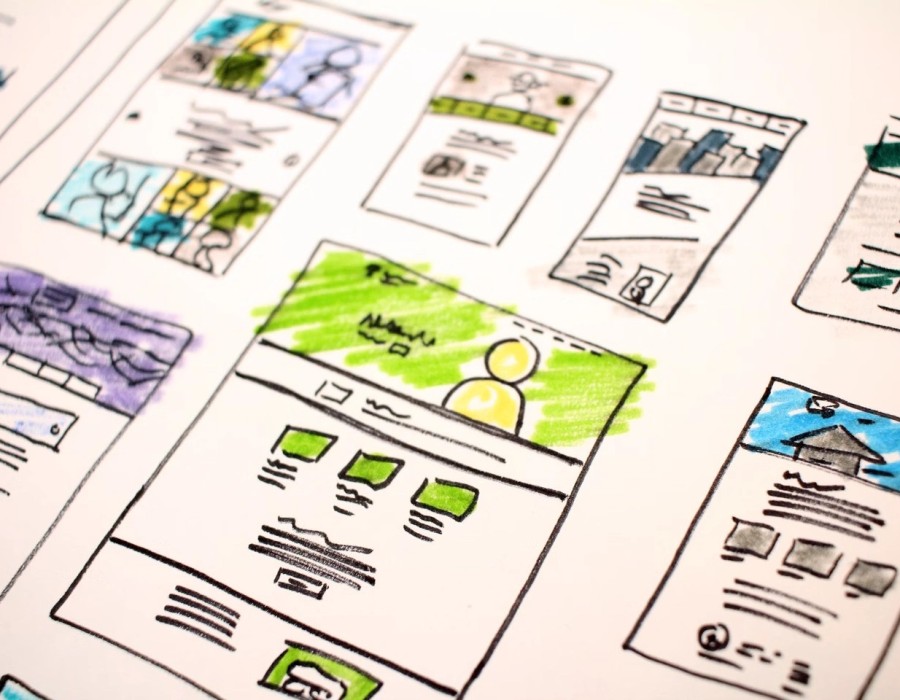
Introduction: The Hidden Architecture of Great Design
Ever landed on a stunning website but didn’t know where to click?
That’s a design without hierarchy.
Visual hierarchy is what separates beautiful websites from effective websites. It’s how you control attention — guiding visitors from curiosity to action. In 2025, where users decide in seconds, hierarchy isn’t just a design rule — it’s a business strategy.
Why Visual Hierarchy Drives Conversions
Your website has one job — help visitors find what they need and take action.
Without a clear visual order, people get lost, confused, and leave.
Studies show that visual hierarchy improves task completion by up to 47%. It gives users direction — making your CTAs more noticeable, your message more memorable, and your brand more trustworthy.
When hierarchy works, every scroll feels intentional. The user’s eye naturally flows from headline → image → CTA — the exact journey you want.
Core Principles of Effective Visual Hierarchy
1. Scale Defines Importance
The bigger the element, the more attention it commands. Use size strategically — large headlines for value statements, medium visuals for context, and smaller text for support.
2. Color Creates Emotion
Color isn’t decoration — it’s direction. Warm tones pull focus, cool tones calm the eye. Use contrast to highlight what matters most, like CTAs or offers.
3. Spacing Builds Breathing Room
Whitespace allows your message to breathe. It helps users focus and reduces cognitive load, which leads to longer time on page and higher engagement.
4. Typography Leads the Eye
Consistent, readable type hierarchy (H1, H2, H3) tells users what’s important without words. The right font weight and spacing can subtly lead users toward your goal.
Design Patterns That Match Human Behavior
Users don’t read — they scan. Eye-tracking studies reveal two dominant viewing patterns:
F-Pattern: Ideal for text-heavy pages and blogs. Users read the top and left edges first.
Z-Pattern: Best for landing pages and hero sections — it mirrors natural eye flow across visuals and CTAs.
Designing with these patterns ensures your message lands exactly where your audience is looking.
Modern Enhancements: Motion & Micro-Interactions
Static layouts are out. In 2025, motion is part of hierarchy.
Micro-animations, hover effects, and scroll transitions subtly signal interactivity and guide focus — without overwhelming the user.
Motion should serve one purpose: reinforce what matters.
The Conversion Formula: Simplicity, Structure, Story
A well-built hierarchy is the design equivalent of storytelling. It gives your page rhythm, flow, and meaning.
When users feel guided — not forced — they trust you more. And trust leads to conversion.
Every design choice should answer one question:
👉 Does this help users take the next step?
How BlazeDream Turns Design into Strategy
At BlazeDream, we combine creativity with conversion science.
Our design team uses eye-tracking, behavioral insights, and UX strategy to create websites where every visual detail earns its place.
We build experiences that are not just visually appealing — but intuitively persuasive.
That’s how we turn first impressions into long-term engagement.
Let’s Design What Your Audience Deserves
Ready to elevate your brand with clarity, focus, and purpose-driven design?
📞 Contact BlazeDream — where visual hierarchy meets measurable performance.
Source: https://www.blazedream.com/blog/the-role-of-visual-hierarchy-in-effective-web-design/
Original source: https://www.blazedream.com/blog/the-role-of-visual
Recommended


Comments