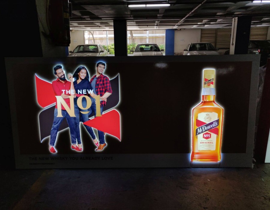
Outdoor signage serves as a powerful tool to capture attention, convey information, and leave a lasting impression on passersby. Whether it's a storefront sign, billboard, or event banner, the design of outdoor signage plays a critical role in attracting customers and enhancing brand visibility. To create the best outdoor signage design, several key elements must be considered, including visibility, readability, branding consistency, and aesthetic appeal. Let's explore how to craft impactful outdoor signage designs that effectively communicate your message and draw in your target audience.
Key Elements of Best Outdoor Signage Design
Visibility: The Best Outdoor Signage Design is to be seen, so visibility is paramount. Consider the location of the sign, lighting conditions, and viewing distance to ensure it stands out effectively. High-contrast colors, bold fonts, and strategic placement can enhance visibility.
Readability: Outdoor signage should be easily readable from a distance. Choose clear, legible fonts and avoid overly decorative styles that may be difficult to read. Text size should be large enough to be seen from a distance without causing strain.
Branding Consistency: Your outdoor signage should align with your brand identity and maintain consistency with your other marketing materials. Use the same colors, fonts, and logo to reinforce brand recognition and create a cohesive brand image.
Simplicity: Keep the design simple and focused on conveying a clear message. Avoid cluttered layouts and excessive text. Use concise and impactful messaging that grabs attention and delivers the intended information quickly.
Contrast: Utilize contrast to make key elements of the signage stand out. Contrast between text and background colors helps improve readability, especially from a distance. High-contrast designs are more likely to catch the eye.
Images and Graphics: Incorporating relevant images or graphics can enhance the visual appeal of outdoor signage. Use high-quality images that are relevant to your message and align with your brand's aesthetic.
Durability: Outdoor signage is exposed to various weather conditions, so it's crucial to choose materials that are durable and weather-resistant. Ensure that your signage can withstand rain, sun exposure, wind, and other outdoor elements.
Tips for Effective Outdoor Signage Design
Choose Appropriate Size: The size of your signage should be proportional to its location and intended viewing distance. Larger signs are ideal for highways and large outdoor areas, while smaller signs work well for storefronts and walkways.
Use Eye-Catching Colors: Bold, vibrant colors can attract attention and create visual interest. However, be mindful of color combinations that may be difficult to read or clash with your branding.
Consider Lighting: If your signage will be displayed at night or in dimly lit areas, consider incorporating lighting elements such as spotlights or LED lights. This ensures visibility and enhances the impact of the design.
Include a Call to Action: Encourage viewers to take action with a clear call to action (CTA). Whether it's visiting your store, calling a number, or visiting a website, a compelling CTA prompts engagement.
Test from Different Angles: Before finalizing your design, view it from different angles and distances to ensure readability and visibility. Consider how it will look to pedestrians, drivers, and passersby.
Highlight Benefits or Offers: If you're promoting a specific product, service, or offer, highlight its benefits prominently on the signage. Use persuasive language to entice customers to learn more.
Use Weather-Resistant Materials: Opt for durable materials such as acrylic, aluminum, PVC, or vinyl for outdoor signage. These materials are weather-resistant and can withstand the elements for long-lasting visibility.
Examples of Effective Outdoor Signage Designs
Bold and Minimalist: A simple yet bold design with large, clear text in high-contrast colors. For example, a white text on a bright red background with the company logo prominently displayed.
Image-Centric: A visually striking design that incorporates a high-quality image related to the brand or message. For instance, a restaurant's outdoor signage featuring appetizing images of its popular dishes.
Interactive Elements: Modern outdoor signage can include interactive elements such as QR codes that allow viewers to scan and access additional information or promotions.
Directional Signage: For businesses in complex locations, directional signage with arrows and clear instructions can guide customers to the entrance or parking area.
Seasonal Themes: Adapting outdoor signage to seasonal themes can add a festive touch. For example, a retail store's signage featuring holiday decorations or seasonal imagery.
Conclusion
Effective outdoor signage design is a crucial aspect of marketing and branding, as it serves as a powerful visual representation of your business. By focusing on elements such as visibility, readability, branding consistency, simplicity, and durability, you can create impactful signage that attracts attention and communicates your message effectively. Whether it's a storefront sign, billboard, event banner, or directional signage, the best outdoor signage designs are carefully crafted to leave a lasting impression on your target audience. With strategic use of colors, fonts, imagery, and calls to action, your outdoor signage can elevate your brand's visibility and draw in customers, ultimately driving business success.
For more info. visit us:


Comments