


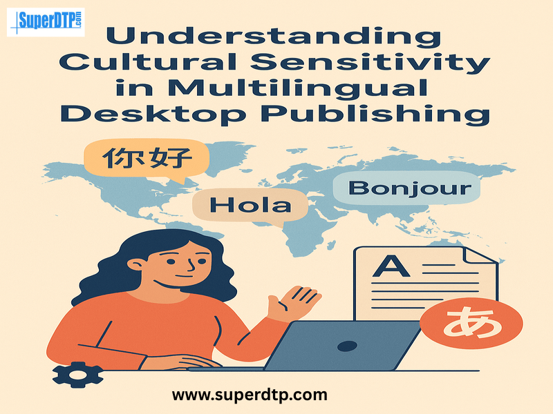
In today’s global business environment, brands are no longer speaking to just one audience. They are reaching out to customers from different countries, languages, and cultures, often all at the same time. This is where multilingual desktop publishing (DTP) plays a vital role. It ensures that documents, marketing materials, and digital content are not only translated accurately but also presented in a way that resonates with local audiences.
However, effective multilingual DTP is not just about placing translated text into a layout. It’s about understanding the cultural background of the target audience and adapting design, colors, images, and even text flow to ensure the content feels natural and respectful. This concept is known as cultural sensitivity, and it can make or break the success of a multilingual project.
Why Cultural Sensitivity Matters in Multilingual DTP
Consider a business introducing a product in several nations.. The marketing brochure might look perfect in English, but when adapted for another market, certain colors, images, or even gestures in photos could have a completely different meaning. For instance, white is connected to sorrow in certain Asian cultures, while it represents purity in many Western civilizations.
Cultural sensitivity ensures that content is free from unintentional mistakes or offensive elements. It allows businesses to communicate in a way that feels inclusive, respectful, and relevant to each audience. In DTP, this doesn’t just apply to text; it extends to typography, layout, images, and even spacing.
Adapting Layouts for Different Languages
Different languages have different text lengths and structures. A sentence in English might be short, while the same sentence in German could be much longer, and in Chinese, much shorter. This can result in crowded text, odd white space, or broken design elements if the layout is not adjusted properly.
Moreover, some languages like Arabic and Hebrew are read from right to left, requiring a complete reversal of the layout to ensure a natural reading flow. This is not just a mechanical flip; icons, images, and navigation elements need to be mirrored carefully to maintain balance and meaning.
Being culturally sensitive means considering these differences early in the DTP process so that the final product looks professional and user-friendly, regardless of the language.
Choosing the Right Fonts and Typography
Fonts are an integral component of a culture and are not just style preferences. Some fonts that look elegant in English may not support characters in Chinese, Thai, or Arabic. Even if they do, certain font shapes might feel informal or inappropriate for a particular audience.
For example, a playful script font may be perfect for a children’s book in English but could be hard to read in Japanese, where clarity is valued for complex characters.
Cultural sensitivity in typography means selecting fonts that support the target language’s script, look aesthetically pleasing, and convey the right tone. It also means ensuring consistency across languages while respecting local preferences.
Color and Symbolism Across Cultures
Colors are powerful, but their meanings change from culture to culture. As mentioned earlier, white has different symbolic meanings in different regions. Red, which can symbolize luck and celebration in China, might be seen as a warning or danger in other cultures.
Similarly, symbols, icons, and imagery may be interpreted differently. A thumbs-up icon may seem positive in many countries, but can be offensive in certain parts of the Middle East.
A culturally sensitive DTP process involves researching the color psychology and symbolism of each target market before finalizing designs. This prevents miscommunication and helps the audience connect more deeply with the content.
Adapting Images for Cultural Relevance
Images are often the first thing people notice in a document or marketing piece. Using culturally inappropriate or irrelevant images can alienate your audience instantly. For instance, an image showing people wearing Western business suits might not resonate with a market where traditional attire is more common in professional settings.
Sometimes, even the way people are posed in images can have cultural implications. Direct eye contact might be seen as confidence in one culture but as disrespect in another.
By choosing culturally relevant and inclusive images, DTP professionals ensure that the message feels relatable and respectful. This might mean replacing images entirely for certain regions rather than using the same visual globally.
Language Nuances and Text Expansion
A culturally sensitive approach also involves understanding the nuances of each language. Literal translations might be technically correct, but could sound unnatural or even rude in the target culture.
Wordplay, humor, and idioms are frequently used in marketing slogans, for instance. These can be nearly impossible to translate directly without losing meaning. In such cases, a transcreation approach, adapting the message creatively while keeping the intent, works better.
In DTP, this also means adjusting text boxes, captions, and callouts so that they can handle longer or shorter translated text without breaking the design.
Accessibility and Inclusivity
Cultural sensitivity also extends to accessibility. The manner which different audiences absorb content varies. Some may require larger fonts, high-contrast colors, or screen-reader-friendly formatting.
When producing multilingual materials, accessibility guidelines such as WCAG and ADA compliance should be considered. This guarantees that individuals with impairments, irrespective of their language or cultural background, can utilize the information.
Collaboration Between Translators and DTP Specialists
Cultural sensitivity in multilingual DTP works best when translators, localization experts, and DTP specialists collaborate closely. Translators understand language nuances, while DTP specialists ensure that these nuances fit seamlessly into the layout.
Early collaboration can prevent costly design changes later. For example, if a translator knows that a certain heading will be significantly longer in Spanish, the DTP team can prepare extra space in advance.
Real-World Example
Consider a global cosmetics brand releasing its product guide in 15 languages. The English version used pink and floral imagery to convey softness and femininity. However, when localizing for the Middle East, the DTP team adjusted the color palette to incorporate gold tones, swapped certain images to feature models wearing culturally appropriate clothing, and adjusted the text direction for Arabic. The result was a guide that felt tailor-made for each market while keeping the brand identity intact.
Without these culturally sensitive changes, the materials might have felt foreign or even alienating to certain audiences.
Steps to Ensure Cultural Sensitivity in DTP
- Research the target culture before designing or adapting content.
- Work with native speakers to review translations and design elements.
- Adapt layouts for language length, reading direction, and typography.
- Check color meanings and imagery relevance for each market.
- Ensure accessibility compliance for inclusivity.
- Test the final output with the local audience before release.
Final Thoughts
Cultural sensitivity in multilingual desktop publishing is not a “nice-to-have,” it’s essential for effective global communication. It ensures that your message is not only understood but also appreciated, respected, and embraced by audiences worldwide.
A design that looks perfect in one culture might send the wrong message in another. By paying attention to language nuances, visual symbolism, and local preferences, you can create materials that truly connect with your audience, no matter where they are.
When multilingual DTP is done with cultural sensitivity at its core, it transforms from a technical service into a bridge between cultures, helping brands and organizations communicate with authenticity and respect.
Super DTP Ltd is a specialized desktop publishing agency located in Gabrovo, Bulgaria, offering book publishing, multilingual DTP, and E-learning localization services to translation agencies and localization companies worldwide! Check our services at www.superdtp.com or contact us at [email protected] for further details.
Comments