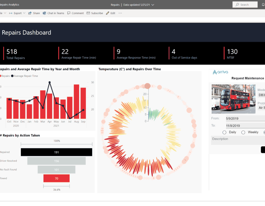
Introduction: In the era of big data, organizations are inundated with vast amounts of information. Transforming this data into actionable insights is crucial for informed decision-making. Microsoft Power BI, a leading business intelligence tool, empowers users to visually analyze and interpret data effectively. This article explores the art and science of data visualization with Microsoft Power BI, shedding light on its features and best practices.
The Power of Visual Storytelling:
Understanding Data Visualization:
Data visualization involves representing complex datasets visually to uncover patterns, trends, and correlations.
Power BI offers a rich array of visualization options, including charts, graphs, maps, and tables, facilitating meaningful storytelling.
The Role of Power BI in Data Visualization:
Power BI goes beyond traditional reporting by offering dynamic and interactive visuals.
The drag-and-drop interface allows users to create compelling visualizations without the need for extensive coding or design skills.
Creating Engaging Visuals in Power BI:
Choosing the Right Visualizations:
Different types of data require different visualization formats. Power BI provides a diverse set of visuals, such as bar charts, line charts, scatter plots, and more. Understanding the nature of the data and the message you want to convey is key to selecting the appropriate visualization.
Customizing Visual Elements:
Power BI allows extensive customization, from color schemes and fonts to data labels and legends.
Utilizing the formatting options ensures that visuals align with corporate branding and enhance overall aesthetics.
Utilizing Custom Visuals and Extensions:
Power BI supports custom visuals and extensions developed by the community, expanding the range of visualization possibilities. Integrating custom visuals can provide unique insights and enhance the visual storytelling experience.
Interactivity and Drill-Down Features:
Dynamic Dashboards:
Power BI enables the creation of dynamic dashboards that allow users to interact with data in real-time.
Interactive elements, such as slicers and filters, provide users with control over the displayed information.
Drill-Down Capabilities:
Users can drill down into specific data points to uncover granular details.
Hierarchical visualizations, like tree maps and sunbursts, enhance the drill-down experience, revealing deeper insights.
Power BI Best Practices for Data Visualization:
Maintaining Clarity and Simplicity:
Avoid information overload by focusing on essential data points.
Simplify visuals to ensure clarity and easy interpretation.
Consistent Design Principles:
Maintain consistency in design elements across reports and dashboards.
Establishing a standardized approach enhances the user experience and fosters a cohesive visual identity.
Performance Optimization:
Optimize visuals for performance, especially when dealing with large datasets.
Utilize Power BI's performance monitoring tools to identify and address potential bottlenecks.
Conclusion: Mastering data visualization with Microsoft Power BI is a journey that transforms raw data into compelling narratives. By harnessing the tool's capabilities and adhering to best practices, organizations can unlock the full potential of their data, driving informed decision-making and fostering a data-driven culture. As businesses continue to navigate the complexities of the digital landscape, proficiency in data visualization becomes a key differentiator for those seeking a competitive edge.
check out our site for more details: -
Predictive Analytics Consulting Firm
Bi Reporting Dashboard Services


Comments